a. Page Breaks
On a standard 8.5x11 inch page with .5 inch margins you’ll want to set breaks on the 10s as a guide. If you are using Detail bands for repeating areas, page breaks will need to be inserted as appropriate after the bands. Set your page breaks by clicking the Page Break icon and dragging onto the page. It will display a horizontal line which you can fine tune by moving it around. Put page breaks on the report for every page right away then you will have a basic framework where you can start laying out the report body items.
Mouse to the bottom of the report body and when the cursor turns to a horizontal bar with small black arrows pointing up and down, drag it down to increase the size of the page. Alternately, click on the body of the report and in the Detail area of the Property Grid enter a Height value. Again, 100 = 1 inch, so 1000 would be 10 inches. We recommend leaving at least a half inch border around the whole report so nothing is cut off.
b. Add Bands/Headers/Footers (if necessary)
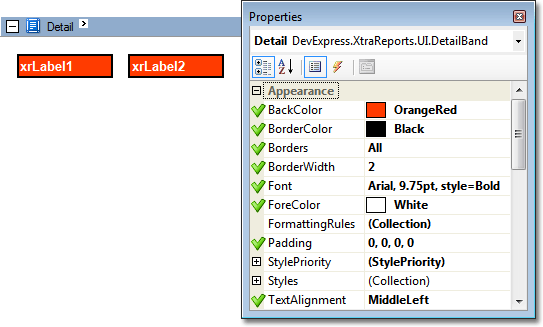
What is a Band? A Report Band represents a specific area on a report page, used to define how to render report controls which belong to it. You can set band properties such as how much space it will occupy on a page, along with other specific properties which define a band's behaviour. Report bands are represented (divided) with band strips.When you create a new blank report, a detail band is automatically added by default (see image below). In this example, the report's area is initially divided into three basic bands (PageHeader,Detail and PageFooter bands), that provide space for placing controls.
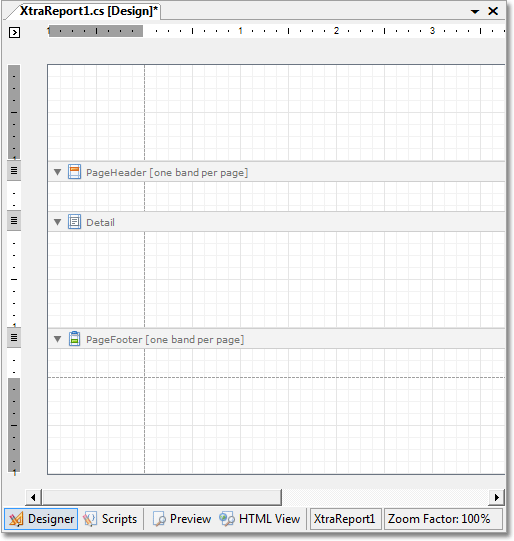
Top Margin Band – This band is located on the top margin of every page, above the Page Header Band or Report Header Band. This band represents information located on the top margin of every page. The Top Margin Band can be used to display information such as, the report date or any other information required on the top margin of each page.
Report Header Band – This band is located at the beginning of a report. This band is intended to display some introductory information, e.g. a cover page for a report. Represents a band used as a header for a report. Objects placed in this band are displayed once, at the beginning of the report.
Page Header Band - Located at the top of every page, below the Top Margin Band or Report Header Band. This band is intended to display page numbers or a table header, continued from the previous page. The Page Header Band can be used for instance, to display the header of a table which has been continued from the previous page. If you want to place some information at the end of every page in a report, use the Page FooterBand object.
Group Header Band - Located at the beginning of every group, or at the top of the group in case it is split across pages. This band specifies grouping criteria, and is used to display information at the beginning of a group of records. If there are no group fields specified, then this band will be shown in its current state.
Detail Band - Located on a page between all other bands. This band displays a single record from the bound datasource at a time, or simply holds unbound controls if there is no datasource assigned to a report. For more information about data binding, refer to Providing Data. Represents a report component that contains controls used for displaying a single record from the primary data source. If there is no primary data source the DetailBand object displays its current state.
The primary data source is the object set by the XtraReportBase.DataSource property. One DetailBand object will be shown in a report for each record in the primary data source, and this band is placed below all the header objects and above all the footer objects that exist in the report.
Detail Report Band – This band is intended to hold the detail report when creating a master-detail report. The Detail Report Band object is used for creating a master-detail report, and this band holds the detail report.
Group Footer Band - Located at the end of every group, or at the bottom of the page if its group is split across pages. This band is primarily intended to show summary information for a group. It represents a band used for displaying information at the end of a group of records.
Report Footer Band - Located at the end of a report. This band is intended to display some final information, e.g. report totals. Objects placed in this band are displayed once at the end of the report. The report footer can include such information as a report summary, grand totals and any other conclusions based on the report.
Page Footer Band - Located at the bottom of every page. This band is intended to display page numbers or a table footer, which has been continued on the following page. It represents a band located at the end of every report page. The Page Footer Band can be used for instance, to display the footer of a table, which is continued on the following page.
Bottom Margin Band – This band is Located at the bottom margin of every page, below the Page Footer Band. It represents a band located on the bottom margin of every page. The Bottom Margin Band can be used to display auxiliary information for instance, the page number or any other information required on the bottom margin of each page.
If your report uses different information for each student you will want to use a repeating band. If the main information is the same but the mark, for example changes, you can hard code the information on each page and enter a field for the mark to be pulled from the system and entered.
Your report can be either bound to data, or unbound. To create a bound report you should first bind the report to a data source, and then specify data binding options for each report control.
Every report that you create is called a banded report. This means that a typical report consists of a number of bands, each of a different type. And, every band may contain report controls.
c) Add Controls
What is a Report Control?
A Report Control represents a specific report element (e.g. static or bound text, line, picture, check box, etc.) which can be inserted into a report. Report controls can reside either inside report bands, or inside other report controls which may serve as control containers (e.g. a panel).
The appearance and behavior of a report control is defined by its type. See the section below to learn more about different report control types available in the current version of XtraReports.
Control Types
Here is a list of basic report controls available in Maplewood’s Report Builder for Report Cards:
Headers and Footers – if the same header and footer is used on each page you can use these commands. If they are using page numbers, build the footer into the body and do not use a footer band.
|
Report Control |
Description |
|
|
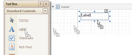
The label control allows inserting single-line or multi-line text into a report. Note that this text may be either static, or populated from a report's datasource. Label - place a label by clicking the Standard Controls area on the left, holding the left mouse button down and dragging onto the report or double-clicking. Set properties from the right option box, like borders, padding, and text style. Only one font type can be used for a label. If you need more than one font type in a label, use the Rich Text option instead. Click the small arrow in the top right corner to see details.
To add report controls at design time, drag an appropriate item from the Tool Box: Standard Controls tab and drop it onto a report.
|
||
|
The check box control is intended to display a True/False or Checked/Unchecked/ Indeterminate state in a report. |
||
|
The rich text control is intended to display, enter and manipulate formatted text. You can enter and format its text at design time, load it from an external file, or bind this control to a data field. |
||
|
|
The picture box control displays an image in a report. Use this control to insert images of different types into your reports. |
|
|
The panel control can contain other report controls. Use it to group controls together, to make their manipulation easier. Panel – use the panel to group areas together. This is handy if you need to move large areas of the report. It will save you from having to move individual cells. |
||
|
The table control inserts a table (containing rows and cells). This control is invaluable if you need to show your data in tabular form. Tables default to 3 columns by 1 row. You can add text to a cell in the table to print on its own, but if you also need to add a data field, the text will be pushed to the back and will not print so you must place a label/rich text box inside the table cell. |
||
|
A single row in a table. Usually, you don't need to work with the table row separately. Use table cells instead. |
||
|
A single cell in a table. Bind its property to a data field, or insert any bound report controls into a cell. |
||
|
Use the line control to draw vertical, horizontal or diagonal lines in a report. You can draw lines and shapes, place image boxes by using the menu options in the Standard Controls area. |
||
|
The shape control embeds any simple graphics into a report. |
||
|
A barcode control allows you to insert many different barcode types into a report. |
||
|
A zipcode control allows the insertion of numbers representing a zipcode into a report. |
||
|
A chart control may be used to represent your data in a graphical view. |
||
|
A pivot grid control (also called as pivot table) represents data from an underlying data source in a cross-tabulated form to create cross-tab reports. |
||
|
A control displays some auxiliary information in a report. For example, you can display page numbers, the current date or user information in your reports. |
||
|
Use the page break control to mark the place where a report should start a new page. Also note that you may use the Band Page Break property instead of this control, if you want to break the page just before or after a particular band. |
||
|
This is a line control, which will cross through the bands. |
||
|
This is a box control, which can expand through the bands. |
||
This section describes the purpose and implementation of the appearance properties - a special set of properties that allow you to customize the appearance of a report or any of its elements.
Every report element (control or band), and a report itself, has a set of properties that specify its appearance. They are listed in the following table.
|
Property name |
Description |
|
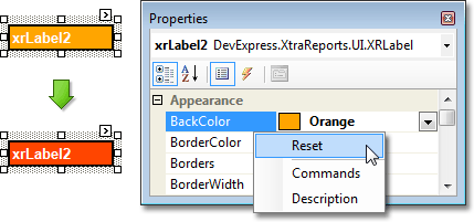
Back Color |
Gets or sets a background color to a report element and its child controls. |
|
Border Color |
Gets or sets a border color to a report element and its child controls. |
|
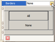
Borders |
Gets or sets borders (top, right, bottom,left), which should be visible for a report element and its child controls. Click Border from the right side to display a drop down list. Use the wide bars to place borders on specific sides, or click All or None.
|
|
Border Width |
Gets or sets a border width to a report element and its child controls. |
|
Font |
Gets or sets the font options (its name, size, etc.) to a report element and its child controls. |
|
Fore Color |
Gets or sets the foreground color to a report element and its child controls. |
|
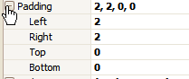
Padding |
Gets or sets the indent values which are used to render the contents of a report element and its child controls. Click Padding from the right to fine tune text/numbers in labels and cells. This example shows 2 spaces from the left and two spaces from the top. This is handy if you don’t want text tight to borders.
|
|
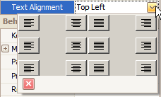
Text Alignment |
Gets or sets the text alignment to a report element and its child controls. Text Alignment – Click Text Alignment from the right side to display a drop down list. Choose from the provided text locations.
|
To reset values of these properties, right-click the required property in the Property Grid, and in the menu, click Reset. Then, the control's actual appearance will be determined by the appropriate properties settings of its parent.
Use the arrow keys to adjust the placement of labels and tables. For fine adjustments, use the Location and Size numeric values in the Layout box on the right side of the screen.
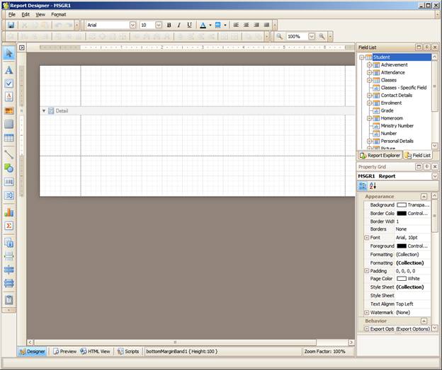
Use the Report Explorer from the right to manually click through your placed fields. Often fields/cells become layered and hidden (sent to back) and you can’t access them by clicking on the main report body. The Report Explorer will display all fields/cells and you can select specific ones which become highlighted in the main report body.
 Picture Box